
INSTAGRAM DISCOVERY
Enhancing content relevance through personalized filtering and local discovery.
Role: UX/UI Designer
Timeline: ~75 Hours
Responsibilities: UX Research · Product Strategy · Information Architecture · User Flow · Wireframing · Visual Design · Prototyping · Usability Testing
Project Type: Existing Product Enhancement
Tools: Figma · Canva
Why Instagram Discovery?
This case study explores how content discovery and personalization could be improved within Instagram’s existing ecosystem. The project initially focused on location-based discovery, helping users explore nearby content and communities more naturally.
However, through user interviews and research, I discovered that many users were more frustrated by irrelevant recommendations and repetitive ads. This shifted the project into a filtering and topic-based discovery system focused on improving content relevance while preserving Instagram’s familiar browsing experience.
Why This Project Exists
Instagram’s Explore experience is designed to help users discover new content, creators, and communities. However, during research and user interviews, I found that many users felt overwhelmed by irrelevant recommendations, repetitive advertisements, and a lack of control over the content shown in their feeds.
While Instagram continuously delivers large amounts of content through algorithm-driven recommendations, users often struggle to personalize what they actually want to explore. Many participants expressed frustration with seeing content unrelated to their interests, while others wanted easier ways to discover topics, communities, or nearby experiences that felt more relevant to their daily lives.
At the same time, this issue also impacts businesses and creators. When recommendations feel disconnected from user interests, advertisements and promoted content become easier to ignore. This project explores how a lightweight filtering and topic-based discovery system could improve content relevance while preserving Instagram’s familiar and fast browsing experience.
Research
To better understand how users interact with Instagram’s discovery experience, I conducted user research focused on browsing behaviors, content preferences, and common frustrations within the platform. The goal was to identify opportunities for improving content relevance while maintaining Instagram’s familiar and lightweight experience.
Initial Direction
The project initially began with the idea of improving local discovery within Instagram. I explored how location-based content could help users connect with nearby communities, businesses, and experiences more naturally through the platform.
Research Approach
To better understand user behavior and frustrations, I conducted open-ended user interviews focused on how people interact with Instagram in their daily lives. Rather than guiding participants toward a specific feature idea, the goal was to uncover genuine behaviors, preferences, and recurring pain points within the platform experience.
Key Findings
Several recurring patterns and frustrations emerged throughout the research process.
Irrelevant Content
Users frequently encountered recommendations unrelated to their interests, making the Explore experience feel overwhelming and less engaging.
Repetitive Ads
Many participants felt that sponsored content appeared too frequently and often lacked relevance to their personal preferences.
Limited Control
Users wanted more control over the type of content shown in their feeds and Explore recommendations.
Personalized Discovery
Participants expressed interest in discovering content based on specific topics, interests, and nearby experiences.
Research Outcome
Research revealed that the larger issue was not simply the lack of location-based discovery, but the broader challenge of content relevance and personalization. As a result, the project direction evolved from a standalone “Nearby” feature into a more flexible filtering and topic-based discovery system.
Design Strategy
Based on the research findings, I redefined the project direction to focus on personalization, content relevance, and flexible discovery. The strategy centered around creating a lightweight system that would give users more control over the content they explore while remaining consistent with Instagram’s existing experience.
Direction Shift
Early research revealed that the larger issue was not simply the lack of location-based discovery, but the broader challenge of content relevance and personalization. Rather than designing a standalone “Nearby” feature, I shifted the project toward a more flexible filtering and discovery system integrated within Instagram’s existing ecosystem. The final direction focused on helping users explore content based on topics, interests, and nearby experiences while maintaining Instagram’s fast and familiar browsing experience.
Design Goals
To guide the experience, I established several key goals that focused on balancing personalization, usability, and platform familiarity.
Improve Relevance
Help users discover content that better matches their interests and browsing preferences.
Maintain Simplicity
Preserve Instagram’s lightweight and familiar browsing behavior without adding unnecessary complexity.
Support Discovery
Allow users to explore topics, communities, and nearby experiences in a more intentional way.
Core Principles
The design approach focused on creating a system that felt natural within Instagram’s existing interaction patterns and user expectations.
Familiar Interaction
Maintain navigation and browsing behaviors already familiar to Instagram users.
Lightweight Filtering
Provide personalization without overwhelming users with complex settings or controls.
Flexible Exploration
Support both interest-based and location-based discovery within a unified experience.
Business Considerations
Beyond improving the user experience, the feature also considered how personalized discovery could better support creators, businesses, and sponsored content within Instagram’s ecosystem.
More Relevant Advertising
Topic-based discovery could help sponsored content feel more aligned with user interests, reducing irrelevant recommendations and improving engagement quality.
Improved Audience Targeting
Businesses and creators could reach audiences more intentionally through personalized interests and nearby discovery categories.
Stronger Content Engagement
Giving users more control over the content they explore could encourage longer engagement and more meaningful interactions across the platform.
Information Architecture
To support a more personalized discovery experience, I explored how filtering, topics, and nearby content could be integrated into Instagram’s existing browsing structure. The goal was to improve content organization and discovery behavior without disrupting the platform’s familiar navigation experience.
Content Organization
The discovery system was organized around personalized topics, followed content, and nearby experiences to create a more flexible exploration experience.
Instead of creating separate browsing paths, content was grouped through lightweight topic-based organization. This allowed users to explore content more intentionally while maintaining Instagram’s familiar browsing behavior.

Users can explore content through lightweight topic categories integrated directly into the browsing experience.
Navigation Integration
The filtering experience was designed to integrate naturally within Instagram’s existing navigation patterns and browsing behaviors. Instead of redesigning the Explore experience entirely, the feature introduced lightweight filtering and topic navigation directly within the existing interface. This approach minimized friction while giving users more control over content discovery.
User Flows
To better understand how users would interact with the filtering and discovery system, I mapped key user flows focused on topic exploration, shortcut personalization, and content management behaviors within the Instagram experience.
Topic Discovery Flow
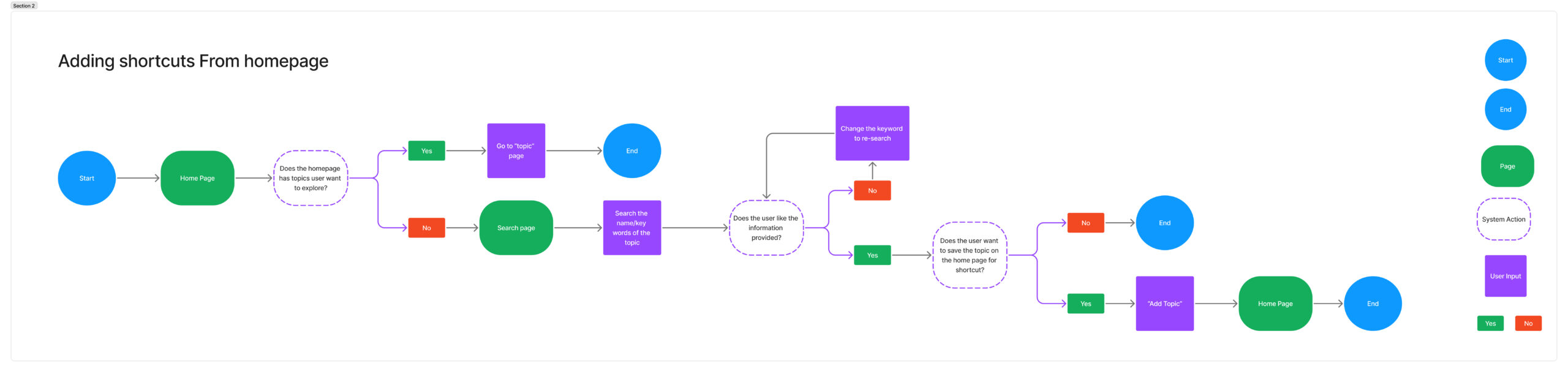
This flow explores how users discover, save, and access personalized topic shortcuts directly from the homepage experience.
Topic Management Flow
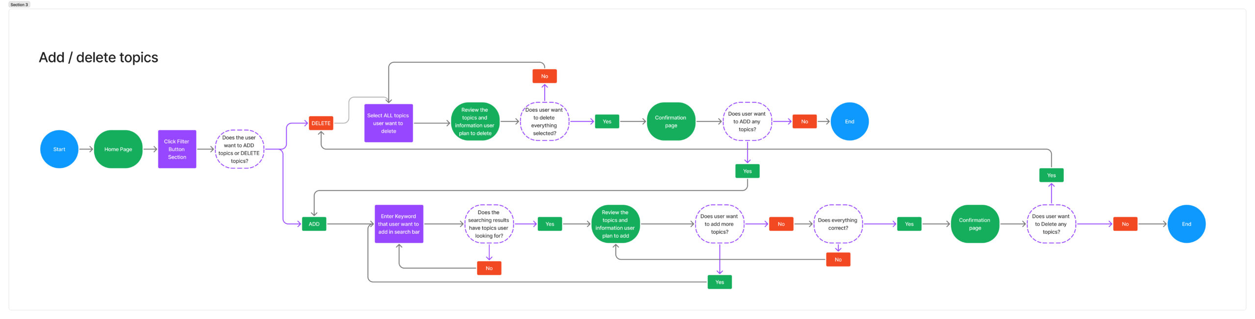
This flow focuses on how users customize, manage, and refine their content interests through lightweight topic management interactions.
Wireframes
After defining the discovery structure and interaction flows, I translated the experience into low-fidelity wireframes to explore layout, navigation behavior, and feature integration within Instagram’s existing interface. The wireframes focused on introducing personalized discovery features in a lightweight and familiar way while preserving the platform’s fast browsing experience.
Feature Breakdown
The platform was organized into several core experience areas based on user goals and research findings.
The structure needed to remain approachable for beginners while still supporting more advanced exploration and planning tools.
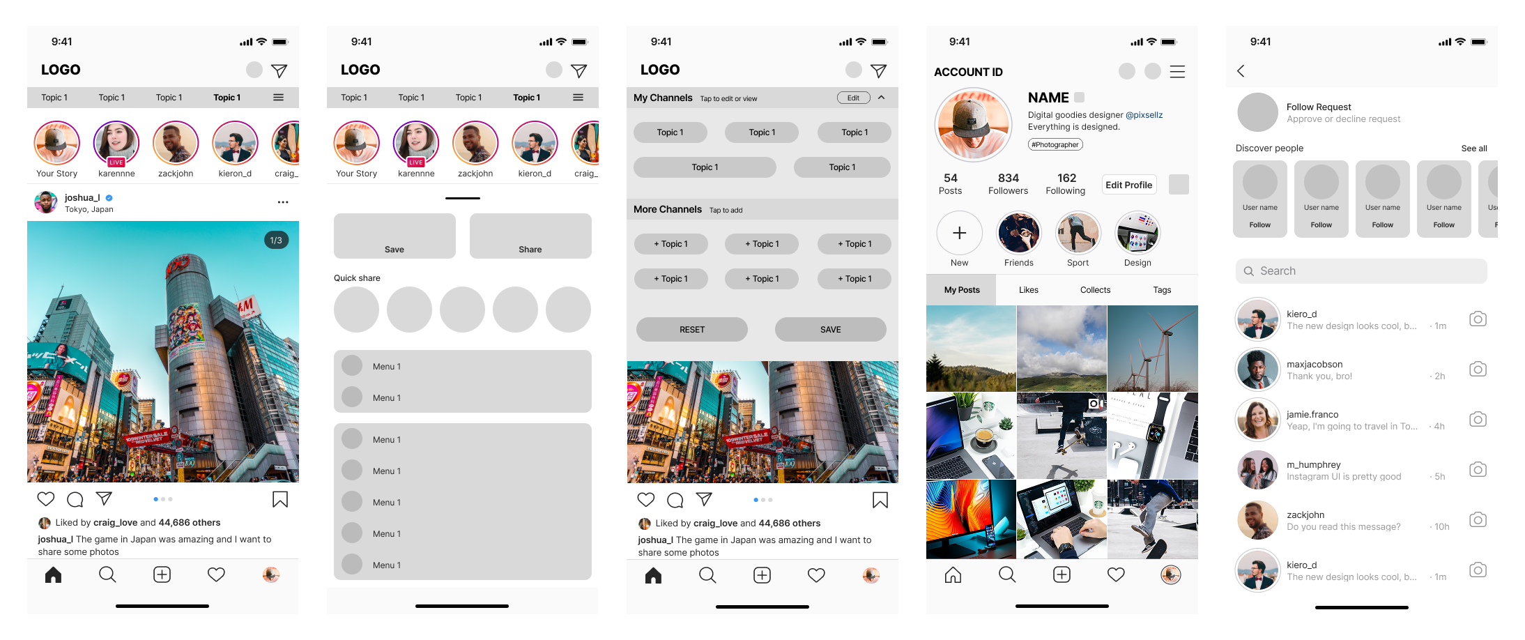
Homepage Topic Integration
Personalized topic shortcuts were integrated directly into the homepage experience, allowing users to quickly switch between interests while maintaining Instagram’s familiar browsing behavior.
Expandable Topic Management
An expandable topic panel allowed users to add, remove, and organize personalized discovery categories through lightweight interactions.
Quick Sharing Interaction
The post interaction menu introduced a faster sharing experience, making it easier for users to send content directly to friends without interrupting browsing behavior.
Content Interaction Organization
Additional sections such as “Likes” and “Collects” were added to the profile experience to help users revisit previously interacted content more efficiently.
Connected Social Discovery
The “Discover People” feature was integrated into the messaging and follow request experience to create stronger connections between social interaction and content discovery.
High-Fidelity Design
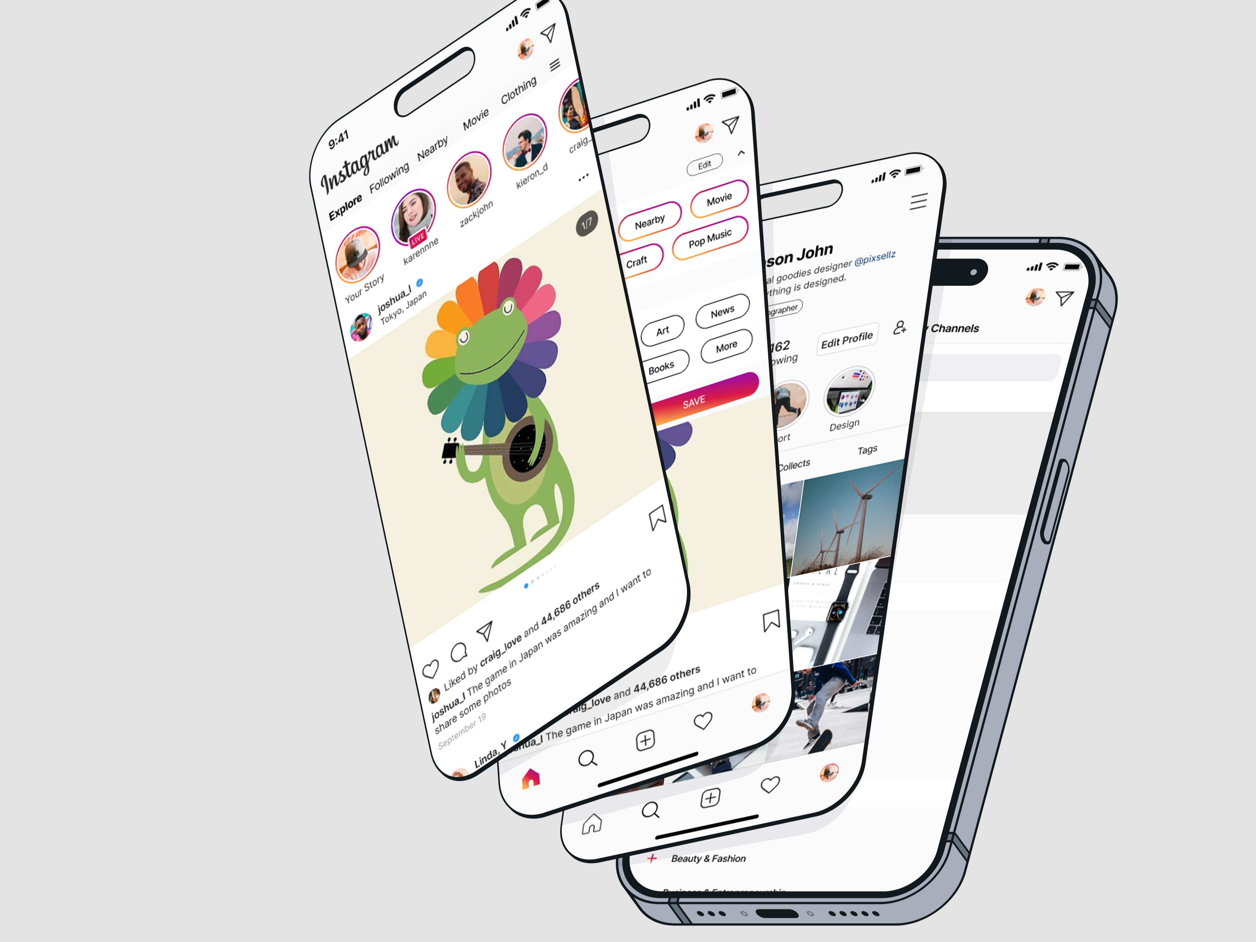
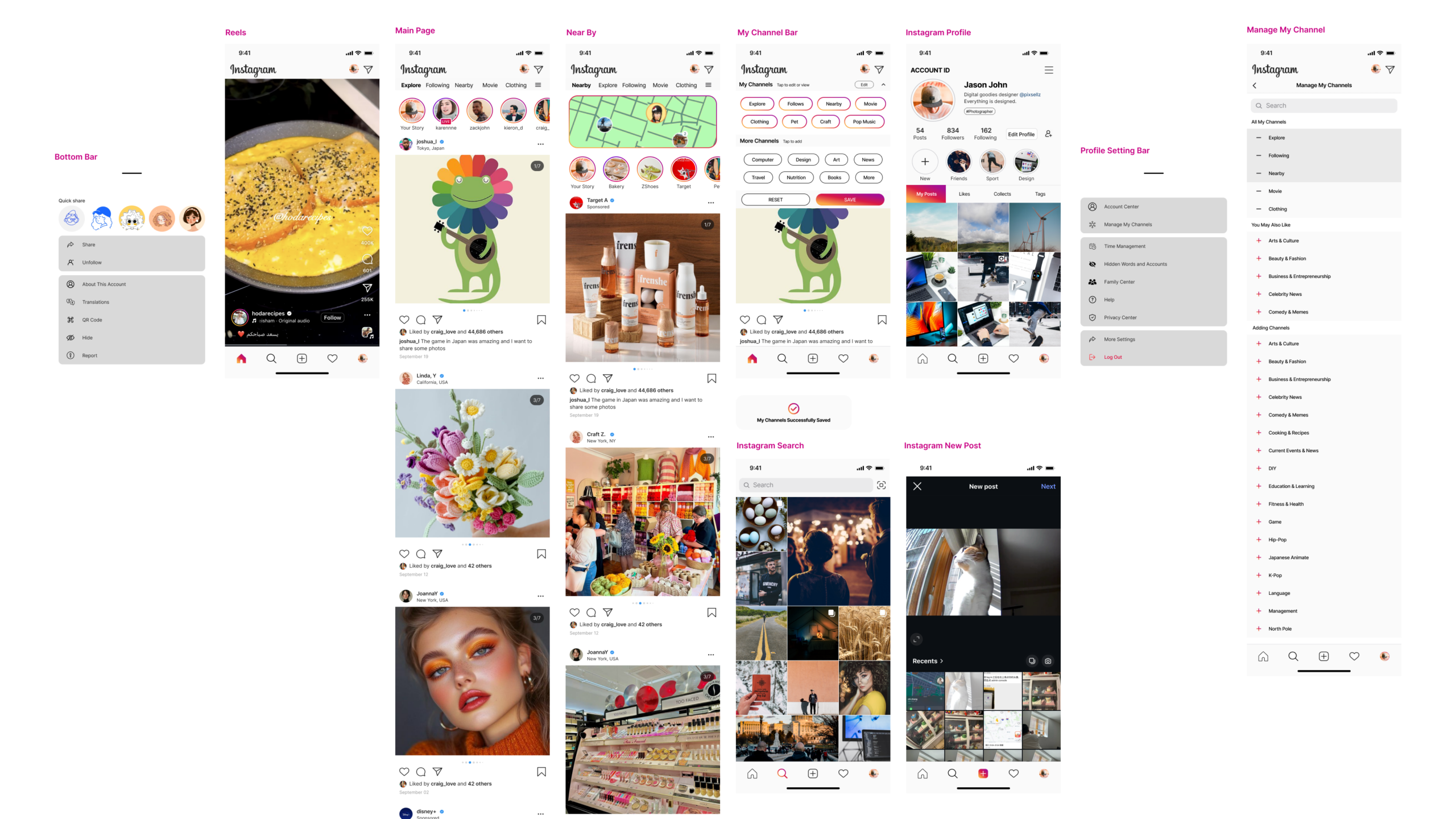
After validating the overall interaction structure through low-fidelity wireframes, I refined the experience into high-fidelity designs that focused on visual consistency, content hierarchy, and seamless integration within Instagram’s existing interface language.
Key Refinements
Personalized Discovery
The final interface introduced topic-based browsing and personalized discovery directly within the homepage experience, allowing users to explore content more intentionally without disrupting Instagram’s familiar interaction patterns.Instagram’s familiar browsing behavior.
Nearby Integration
Location-based discovery was integrated as part of the broader filtering system, allowing nearby content to function naturally alongside personalized interests and topic exploration.
Flexible Topic Management
Users could customize and organize their preferred topics through lightweight management interactions, creating a more flexible and personalized browsing experience.
Enhanced Content Organization
Additional sections such as “Likes” and “Collects” helped users revisit previously interacted content more efficiently while improving overall content organization.
Connected Social Interaction
Social discovery features such as sharing, messaging, and “Discover People” were reorganized to create stronger connections between communication and content exploration behaviors.
Visual Consistency
To maintain familiarity within Instagram’s existing ecosystem, the new interactions and components were designed using visual patterns already established within the platform. Elements such as gradient action buttons, lightweight topic pills, rounded components, and minimal navigation adjustments helped the feature feel naturally integrated rather than visually disruptive. The goal was not to redesign Instagram, but to extend its existing experience while preserving user familiarity and interaction consistency.
Usability Testing & Iteration
To evaluate the effectiveness of the personalized discovery experience, I conducted usability testing focused on navigation clarity, topic management, and overall content exploration behavior. The testing helped identify friction points and opportunities for refinement before finalizing the prototype experience.
Testing Objectives
The testing focused on three main areas: whether users could understand the new Filter and Nearby features, whether they could customize topics easily, and whether the added interactions felt natural within Instagram. Success was measured through task completion, time spent per task, reported difficulty, and overall satisfaction.
User Feedback
Overall, participants were able to complete the tasks successfully. Users liked the clarity of the Filter function, found the Explore, Following, and Nearby tabs easy to switch between, and appreciated the idea of customizable topics.
However, several issues were also identified. Some users felt the filter bar was difficult to read, the selected and unselected topic states were not clear enough, and certain transitions felt rough. Users also mentioned that the topic settings layout felt crowded, the Nearby feature needed clearer explanation, and account-page navigation needed a clearer back option.
Design Improvements
Based on the feedback, I refined the filter bar by increasing the font size from 12pt to 14pt and improving the selected topic state for better readability. I also simplified some animation effects to reduce distraction and make transitions smoother.
To improve navigation, I added a clearer flow from “More” to the “Manage My Channel” page, adjusted spacing between topics to prevent accidental taps, and added a back button for smoother movement between pages. I also introduced a “You May Also Like” section in “Manage My Channel,” allowing the system to suggest topics based on users’ liked or interacted posts.
Final Prototype
The final prototype demonstrates how personalized discovery, topic management, and nearby exploration work together within Instagram’s existing browsing experience. The interactions were designed to remain lightweight, intuitive, and visually consistent with Instagram’s familiar ecosystem.
Prototype Highlights
* Topic-based personalized discovery
* Nearby content exploration
* Topic customization and management
* Improved content organization
* Lightweight integration within Instagram’s existing interface
Final Thoughts
What I Learned
This project taught me how limited personal assumptions can be when designing new product features. At the beginning of the project, I believed that a “Nearby” feature would be the most valuable direction from both user and business perspectives. However, through user interviews and research, I discovered that the larger frustration was not location discovery itself, but the overwhelming amount of irrelevant content and advertisements users experienced within Instagram.
This experience reinforced the importance of user research and feedback throughout the design process. Listening to users completely changed the direction of the project and helped uncover a more meaningful problem centered around personalization, content relevance, and user control.
I also learned how challenging it can be to design within an existing and highly mature product ecosystem. Introducing new features without disrupting familiar behaviors, navigation patterns, and visual consistency required careful decision-making throughout the entire process.
Future Improvements
If I continued developing this project, I would further expand and refine the filtering system to support a wider range of personalized topics and smarter recommendation behaviors.
Due to space limitations within the homepage experience, the current design only supports a limited number of visible topic shortcuts. In a more developed version, I would explore scalable topic management systems, adaptive recommendations, and more flexible personalization options that could better support different browsing behaviors and user interests over time.
I would also continue improving how nearby discovery integrates with personalized content recommendations to create a more dynamic and context-aware browsing experience.
UX/UI Reflection
Looking back on this project, I see it more as a product thinking project rather than simply a UI redesign exercise. Since Instagram is already a highly established platform, the biggest challenge was not creating an entirely new interface, but understanding how to introduce meaningful improvements within an existing ecosystem.
Throughout the project, I intentionally preserved Instagram’s familiar layout, interaction patterns, typography, and visual language while identifying opportunities to integrate new discovery features naturally into the experience. Maintaining visual consistency — including familiar colors, gradients, spacing, and navigation behaviors — became an important part of making the new interactions feel intuitive rather than disruptive.
This project reinforced my understanding that successful UX/UI design is not only about adding features, but about balancing usability, familiarity, and product integration in a way that feels seamless to users.