
OPPULAND
A responsive e-commerce redesign for a real nutritional supplement brand, focused on building trust, improving product discovery, and creating a consistent shopping experience across desktop, tablet, and mobile.
Role: UX/UI Designer
Timeline: 75 Hours
Responsibilities: Stakeholder Interview · User Research · Information Architecture · Responsive Design · Wireframing · Visual Design · Prototyping · Usability Testing
Tools: Figma · Canva
Why Oppuland
Oppuland is a nutritional supplement company offering a wide range of vitamins, minerals, and wellness products designed to support healthier lifestyles. As an e-commerce business in the health and wellness industry, the website plays a critical role in building customer trust, communicating product value, and helping users make informed purchasing decisions.
I chose Oppuland because it presented an opportunity to work on a real-world e-commerce redesign challenge. Unlike creating a product from scratch, redesigning an existing website required balancing business goals, user needs, and brand identity while improving the overall experience. The project also allowed me to explore responsive design across desktop, tablet, and mobile platforms, as well as create a complete visual system focused on trust, usability, and product discovery.
The Problem
Working with a real-world supplement brand presented unique challenges beyond aesthetics. The redesign needed to balance business objectives, user expectations, and responsive usability while creating a more trustworthy and scalable e-commerce experience.
Building Trust
The website lacked visible trust signals such as certifications, reviews, and detailed product information, making it difficult for users to confidently evaluate products.
Product Discovery
Users struggled to quickly find relevant supplements due to unclear navigation, limited categorization, and inconsistent information hierarchy.
Responsive Experience
The experience needed to work seamlessly across desktop, tablet, and mobile devices while maintaining consistency and usability.
Visual Consistency
The interface lacked a cohesive visual system that reflected the professionalism, quality, and credibility of the brand.
Research Overview
To better understand both business objectives and user needs, I conducted stakeholder interviews, user interviews, and competitor analysis. This research helped identify opportunities to improve trust, product discovery, responsiveness, and the overall shopping experience.
Stakeholder Interview
Participant - Oppuland Brand Manager
To better understand the company’s vision, business goals, and existing challenges, I conducted an interview with Oppuland’s Brand Manager. This helped align the redesign with both user needs and business objectives.
Research Goals
* Understand business objectives
* Identify current website challenges
* Learn about the target audience
* Explore future growth opportunities
* Understand branding priorities
Key Takeaways
* Oppuland wanted to improve trust and credibility through a more professional digital presence.
* The website needed clearer product organization to support business growth.
* Responsive consistency was important to reach users across multiple devices.
* The redesign needed to balance business objectives with user expectations.
User Interviews
Participants
To understand different shopping behaviors and expectations, I interviewed users with varying levels of health supplement knowledge and online shopping experience.
Health-Conscious Parent
Regularly purchases supplements for family members and prioritizes safety, trust, and product transparency.
Fitness-Oriented Consumer
Frequently researches supplements and values efficiency, comparison tools, and detailed product information.
Key Takeaways
* Users rely heavily on trust signals when purchasing health supplements.
* Product information and certifications should be easy to find and understand.
* Users expect intuitive navigation and category structures.
* Different user groups require different levels of product education and detail.
Competitor Analysis
To better understand industry standards and user expectations, I analyzed leading supplement brands including Sports Research, New Chapter, and Codeage. I focused on navigation, product presentation, trust-building elements, and responsive design patterns.
Clear Product Discovery
Successful competitors used intuitive navigation and well-organized product categories to help users quickly find relevant products.
Strong Trust Signals
Certifications, reviews, and transparent product information helped build credibility and support purchasing decisions.
Consistent Visual Identity
A cohesive visual system strengthened brand recognition and improved the overall user experience.
Responsive Shopping Experience
Layouts adapted effectively across desktop, tablet, and mobile while maintaining consistency and usability.
Key Takeaways
* Leading competitors prioritize clear product discovery through organized navigation.
* Trust-building elements such as reviews, certifications, and transparent product information are consistently visible.
* Strong visual systems reinforce credibility and brand recognition.
* Responsive experiences adapt layouts across devices while maintaining consistency.
Defining the Direction
Research revealed several opportunities to improve Oppuland’s online experience. By synthesizing findings from stakeholder interviews, user interviews, and competitor analysis, I defined the core problem and established a clear set of goals to guide the redesign process.
The Problem
Oppuland's existing website lacked clear navigation, trust-building elements, and a cohesive responsive experience, making it difficult for users to confidently discover products and complete purchases across devices.
The Goals
To translate the research insights into a cohesive product experience, I prioritized features that supported the most critical parts of the stargazing journey while balancing accessibility, usability, and engagement.
Build Trust
Increase credibility by making certifications, product details, and customer reviews more visible, helping users feel confident in their purchasing decisions.
Improve Product Discovery
Create a clearer navigation structure and product organization system that allows users to quickly find products relevant to their health and wellness goals.
Create Responsive Consistency
Design a cohesive experience across desktop, tablet, and mobile platforms while adapting layouts to different user behaviors and screen sizes.
Strengthen Brand Presence
Develop a unified visual system that communicates professionalism, product quality, and the brand’s commitment to health and wellness.
Information Architecture
To improve product discovery and simplify the shopping experience, I first restructured the website’s information architecture and mapped key user journeys. These artifacts helped align navigation, content organization, and business objectives before moving into wireframing and visual design.
Sitemap
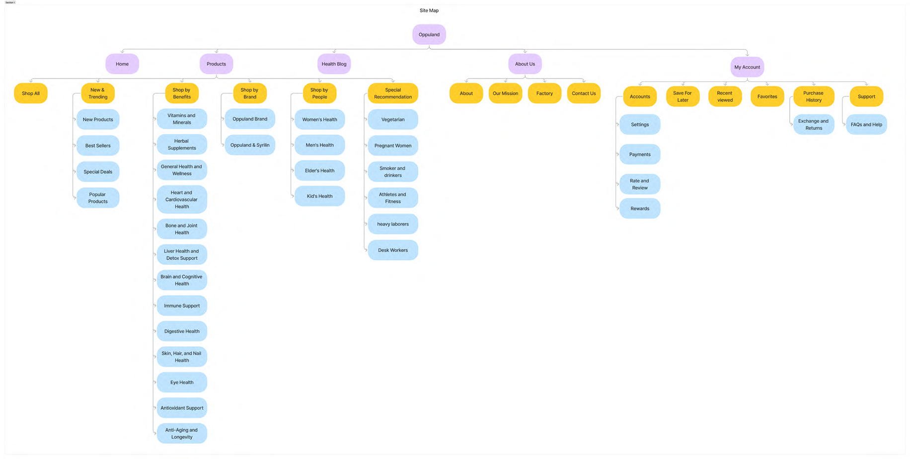
The sitemap reorganized content into clearer categories, making it easier for users to browse products by health goals, brands, and target audiences while supporting future content expansion.
User Flows
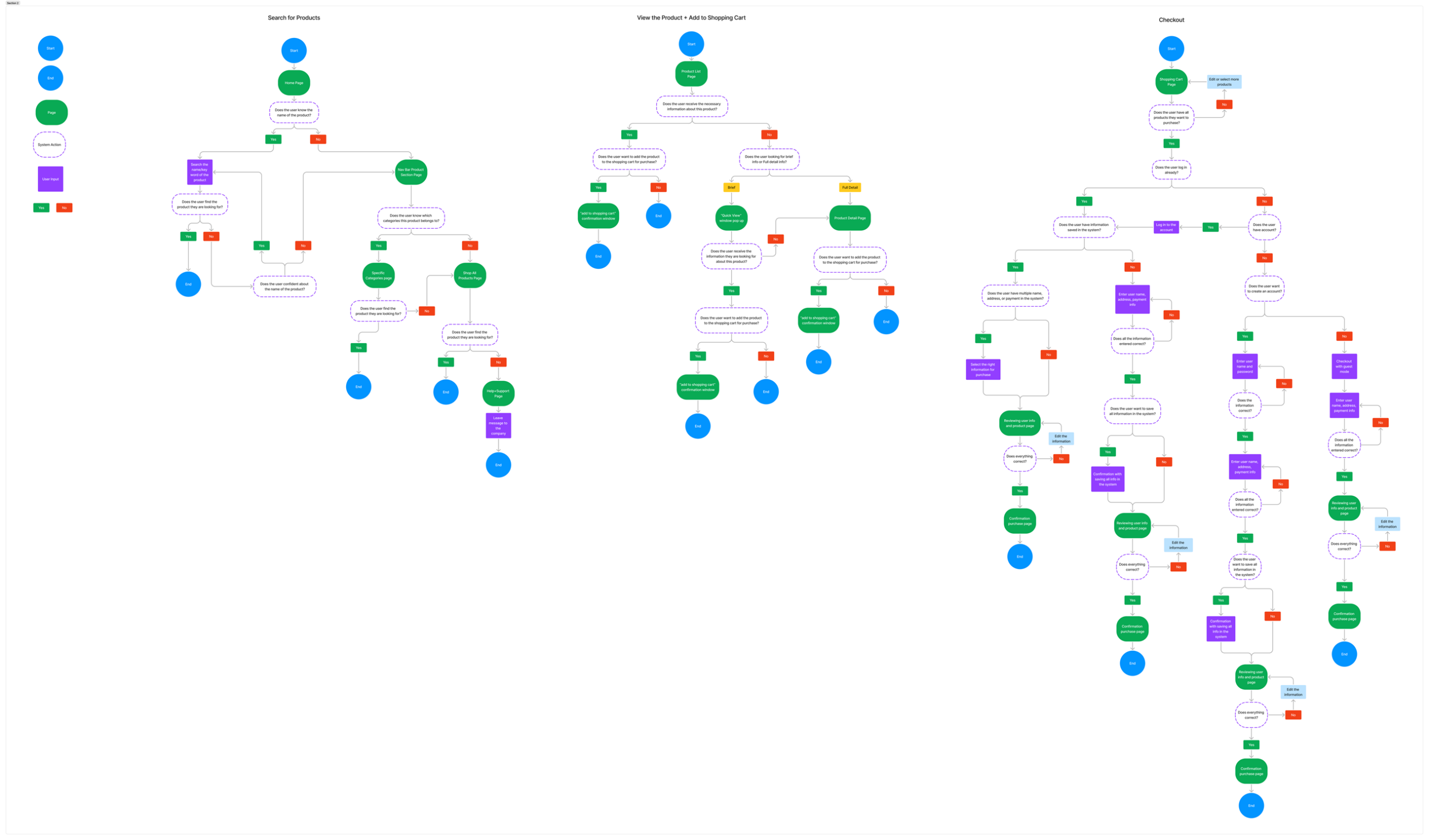
To better understand how users would interact with the redesigned experience, I mapped out key user journeys focused on product discovery and purchasing.
Product Search
Users can browse by category or search directly for products that match their health and wellness needs.
Product Evaluation
Users can review product details, benefits, ingredients, certifications, and customer feedback before adding items to their cart.
Checkout Experience
A streamlined checkout flow minimizes friction and guides users through payment and order confirmation.
Responsive Design Strategy
As a responsive web design project, the experience was designed across desktop, tablet, and mobile breakpoints. Rather than simply scaling content, each layout was adapted to support different user behaviors while maintaining a consistent shopping experience.
Desktop
Prioritized product exploration, promotional content, and detailed information.
Tablet
Balanced browsing efficiency with touch-friendly interactions and simplified layouts.
Mobile
Focused on streamlined navigation, quick product discovery, and efficient checkout flows.
Responsive Wireframing
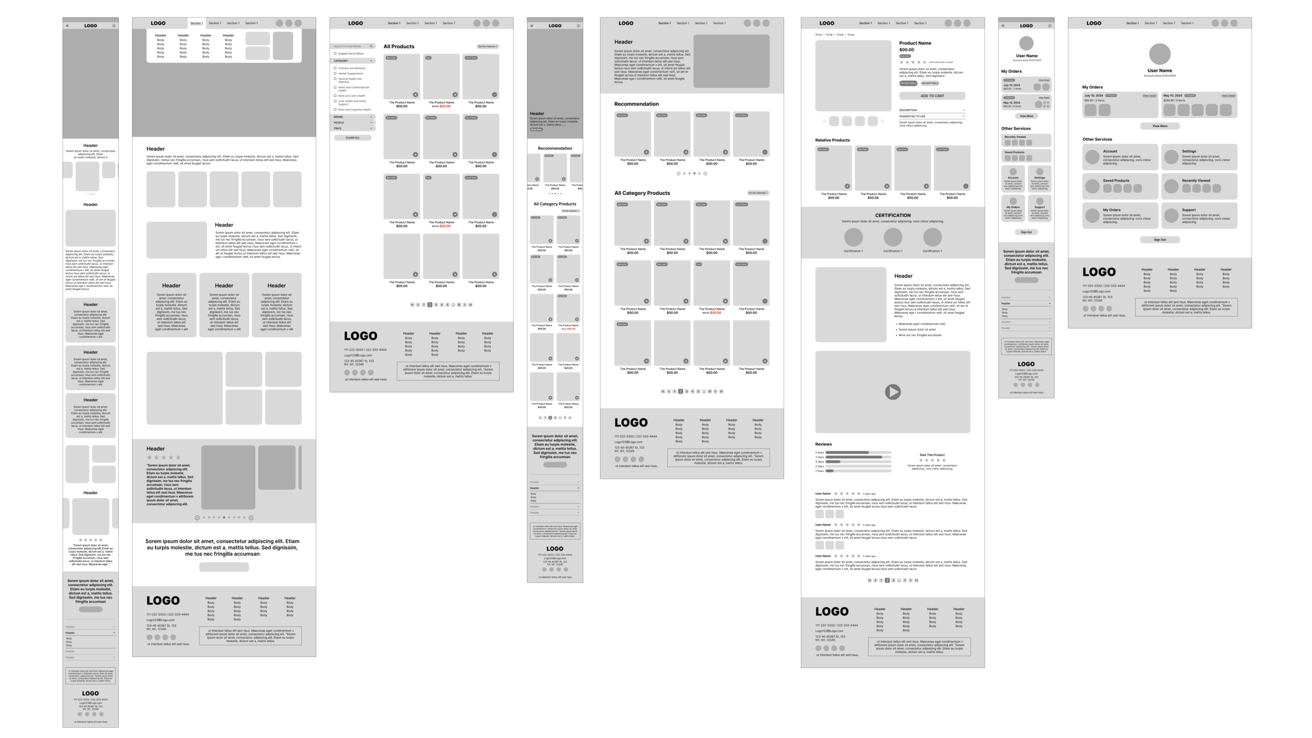
Before exploring visual design, I created responsive wireframes to establish layout structure, content hierarchy, and interaction patterns across desktop and mobile experiences. This phase allowed me to validate navigation, product discovery, and checkout flows before moving into high-fidelity designs.
Homepage
Focused on communicating brand credibility, featured products, and educational content while maintaining a scalable layout across screen sizes.
Product Browsing
Explored filtering, categorization, and product discovery patterns to help users efficiently navigate a large product catalog.
Product Detail & Account Experience
Prioritized product information, trust signals, reviews, and account management features to support purchasing decisions and post-purchase engagement.
Visual System & Atmosphere
After establishing the website structure and responsive layouts, I explored visual directions that would help Oppuland communicate trust, professionalism, and wellness-focused branding.
Moodboard
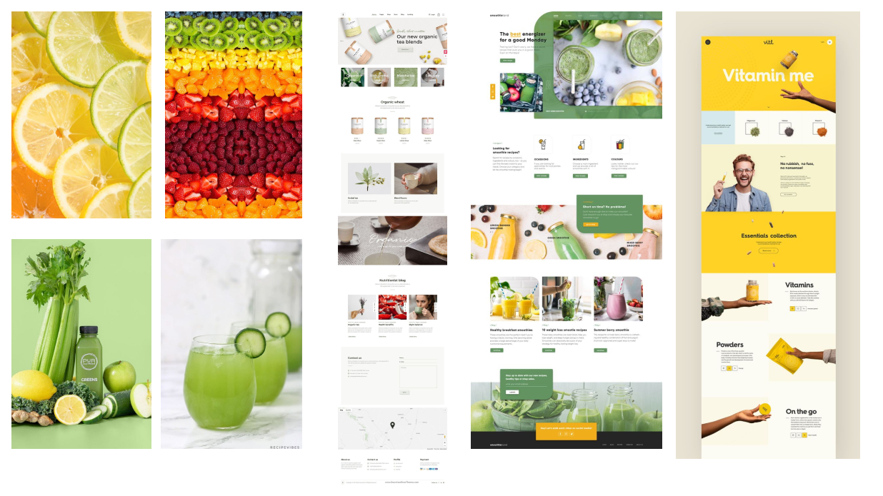
As a dietary supplement brand, Oppuland is closely connected to ideas of health, wellness, and vitality. I drew inspiration from fresh fruits, vegetables, and natural ingredients to explore colors and imagery that communicate freshness and healthy living. At the same time, I analyzed health and supplement websites to understand how successful brands establish trust through layout, typography, and visual hierarchy. By combining vibrant, nature-inspired elements with a clean and professional interface, I created a visual direction that feels both fresh and credible.
Typography
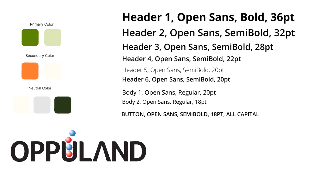
Open Sans was selected for its clean, professional, and highly readable appearance. As Oppuland serves a broad audience, including middle-aged and older adults, the typeface helps improve readability while reinforcing a trustworthy and reliable brand image.
Color Palette
The color palette was inspired by health, wellness, and natural ingredients. Green serves as the primary color to represent freshness, vitality, and healthy living. Orange is used as an accent color to highlight key actions and important information while subtly referencing vitamin-rich fruits and nutrition. Neutral tones were added to maintain visual balance and create a clean, professional experience without overwhelming users.
Final Design
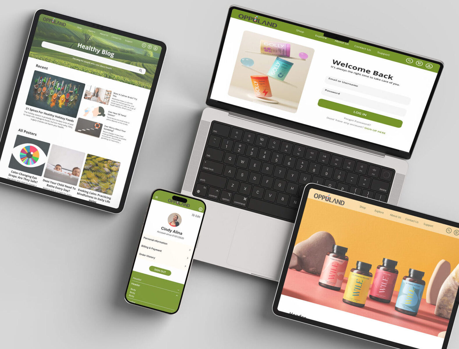
Based on research findings, project goals, and the redesigned information architecture, I developed a complete responsive e-commerce experience that supports product discovery, education, purchasing, and account management across desktop and mobile devices.
Browsing & Discovery Experience
Helping users explore products and learn about wellness
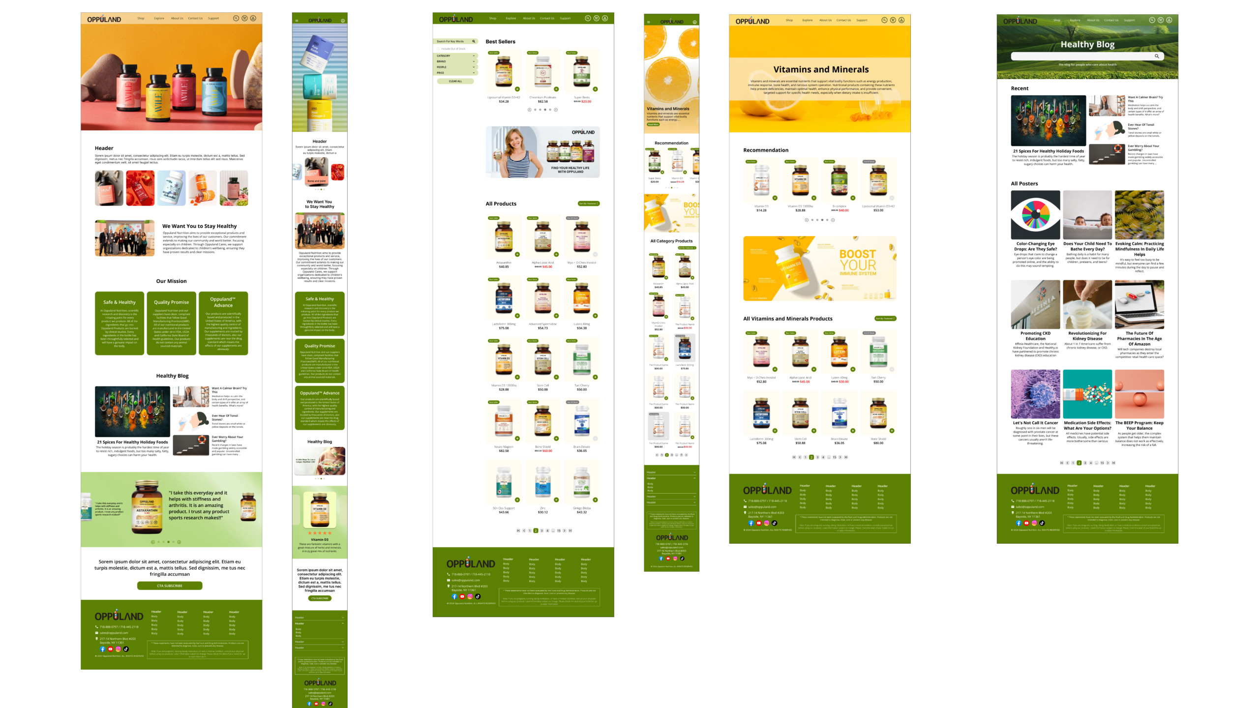
This section focuses on the discovery stage of the shopping journey. The redesigned homepage, category pages, and blog experience were created to improve navigation, highlight product categories, and provide educational content that supports purchasing decisions.
Key Design Decisions
- Introduced clearer product categorization and navigation.
- Highlighted featured products and promotional content.
- Integrated educational blog content to support user trust and product awareness.
- Maintained consistent experiences across desktop and mobile layouts.
Shopping & Account Experience
Supporting confident purchases and long-term engagement
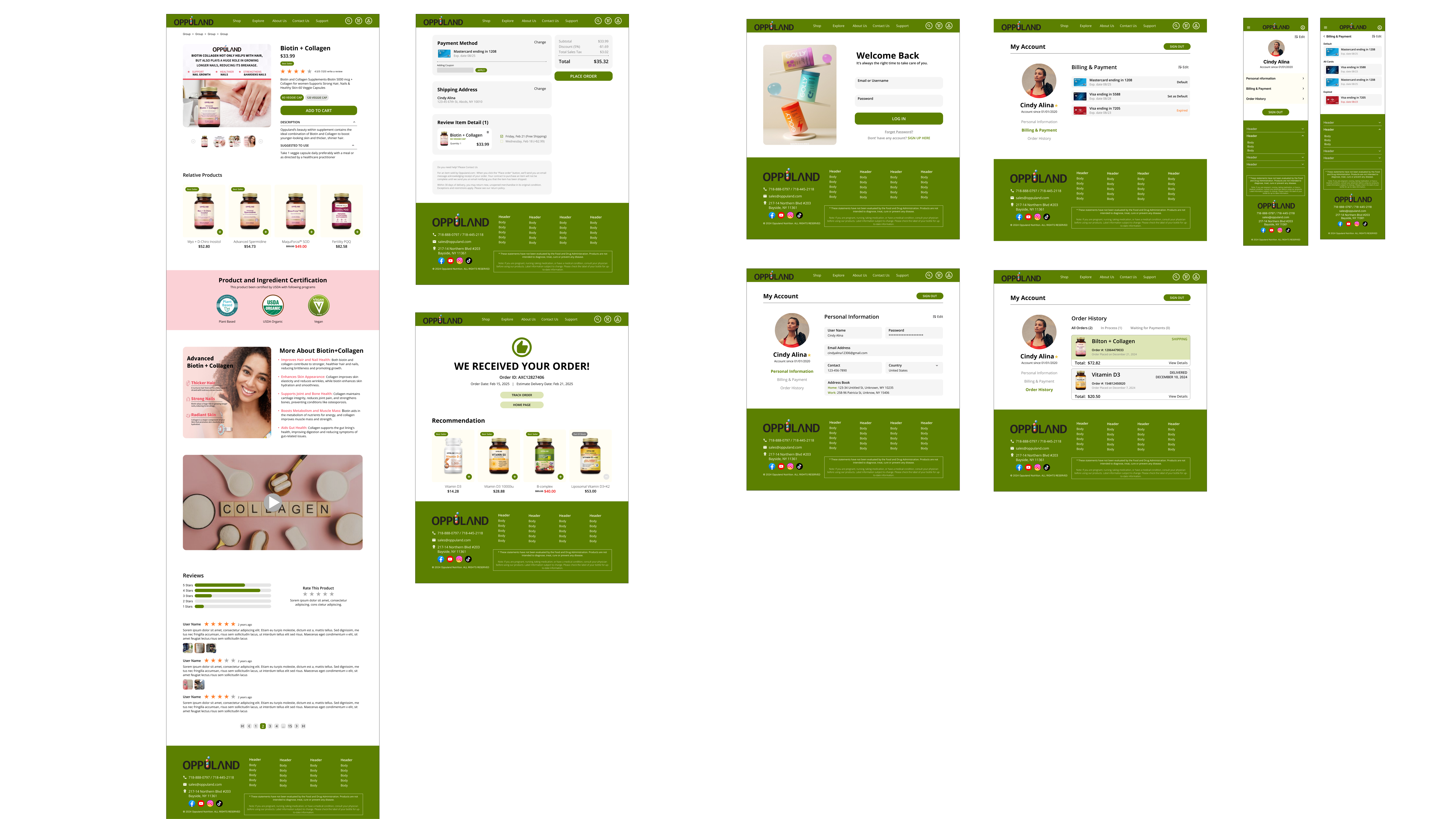
This section focuses on the later stages of the customer journey, including product evaluation, checkout, and account management. The experience was designed to increase transparency, streamline purchasing, and encourage returning customers.
Key Design Decisions
- Added product certifications, reviews, and ingredient information to build trust.
- Simplified the checkout flow with clearer payment and order confirmation steps.
- Created a centralized account area for profile management, order history, and saved products.
- Extended responsive patterns across shopping and account-related experiences.
Interactive Prototype
Explore the redesigned Oppuland experience through an interactive prototype, including product discovery, checkout, and account management flows.
Usability Testing & Iteration
After completing the high-fidelity designs and interactive prototype, I conducted usability testing to evaluate whether the redesigned experience successfully improved navigation, product discovery, trust, and the overall shopping flow. The goal was to identify any remaining usability issues before finalizing the design and ensure that the experience aligned with both user needs and business objectives.
Testing Goals
The usability testing focused on four key areas:
Easy Navigation
Can users quickly understand the website structure and move between major sections without confusion?
Product Discovery
Can users easily browse categories, locate products, and find relevant health information?
Trust & Transparency
Do users feel confident about product quality, certifications, ingredients, and company credibility?
Checkout Efficiency
Can users complete the purchase process smoothly with minimal friction?
Key Feedback
Participants responded positively to several aspects of the redesign:
Clean and professional visual design
Consistent branding across pages
Easy product browsing experience
Clear product detail presentation
Improved trust through certifications and product information
Several usability issues were identified during testing:
Product categories were not immediately clear for first-time visitors
Important trust elements such as certifications required additional scrolling
Checkout flow felt longer than expected
Account-related features were difficult to locate quickly
Navigation hierarchy could be simplified in certain sections
Iterations & Improvements
Refining the Experience
Based on usability testing insights, several improvements were implemented to address user concerns and strengthen the overall experience.
Navigation Improvements
Added a dedicated "Shop All" entry point and refined menu organization to make product discovery more intuitive.
Stronger Trust Signals
Moved reviews, certifications, and product highlights into more visible positions on product detail pages.
Streamlined Checkout
Simplified checkout steps and introduced clearer progress indicators to help users understand where they are in the purchasing process.
Better Account Management
Reorganized account-related features into clearer categories and improved accessibility from the main navigation.
Layout & Visual Enhancements
Updated imagery, adjusted spacing, and simplified page layouts to improve readability and reduce cognitive load.
Final Thoughts
What I Learned
Working on Oppuland taught me that designing for a real business is very different from designing a conceptual project. Unlike self-directed projects, I had to balance user needs with business goals and stakeholder expectations. Every design decision needed to consider not only usability, but also branding, marketing, and business requirements.
This project also strengthened my understanding of e-commerce design. Compared to other types of digital products, e-commerce experiences require clear navigation, straightforward user flows, and carefully structured product information. With a large number of products and categories, layout planning became especially important to ensure the interface remained both visually organized and easy to use.
Future Improvements
Given more time, I would continue refining the checkout experience by simplifying certain steps and further improving the overall purchasing flow. I would also explore implementing a loyalty and rewards program to encourage repeat purchases and strengthen customer retention.
From a visual design perspective, I would revisit the color system. While the current palette successfully communicates health and freshness, I would explore a more balanced approach that introduces greater sophistication and professionalism while maintaining the brand's healthy and approachable personality.
UX/UI Reflection
This project leaned heavily toward UI design while still requiring strong UX thinking throughout the process. Beyond designing the website experience, I also created responsive layouts across desktop, tablet, and mobile screens, ensuring consistency while adapting the interface to different devices.
One of the biggest challenges was finding the right balance between professionalism and vitality. As a health supplement brand, Oppuland needed to feel trustworthy, established, and credible, while still communicating wellness, freshness, and energy. Learning how visual design choices influence brand perception helped me better understand the relationship between aesthetics, usability, and business objectives.